GSK OFFICE SPACE DESIGN - functional and aesthetic transformations
Our task was to adapt a 400m2 business space, already occupied by a large company, for new business requirements and addressing any deficiencies the client encountered in the existing state. We resolved numerous functional issues and, in terms of aesthetics, the client's request was to create a more luxurious space with a youthful playfulness.
We achieved protection from the low western sun by choosing blackout roller blinds that were color- coordinated with the existing exterior joinery.
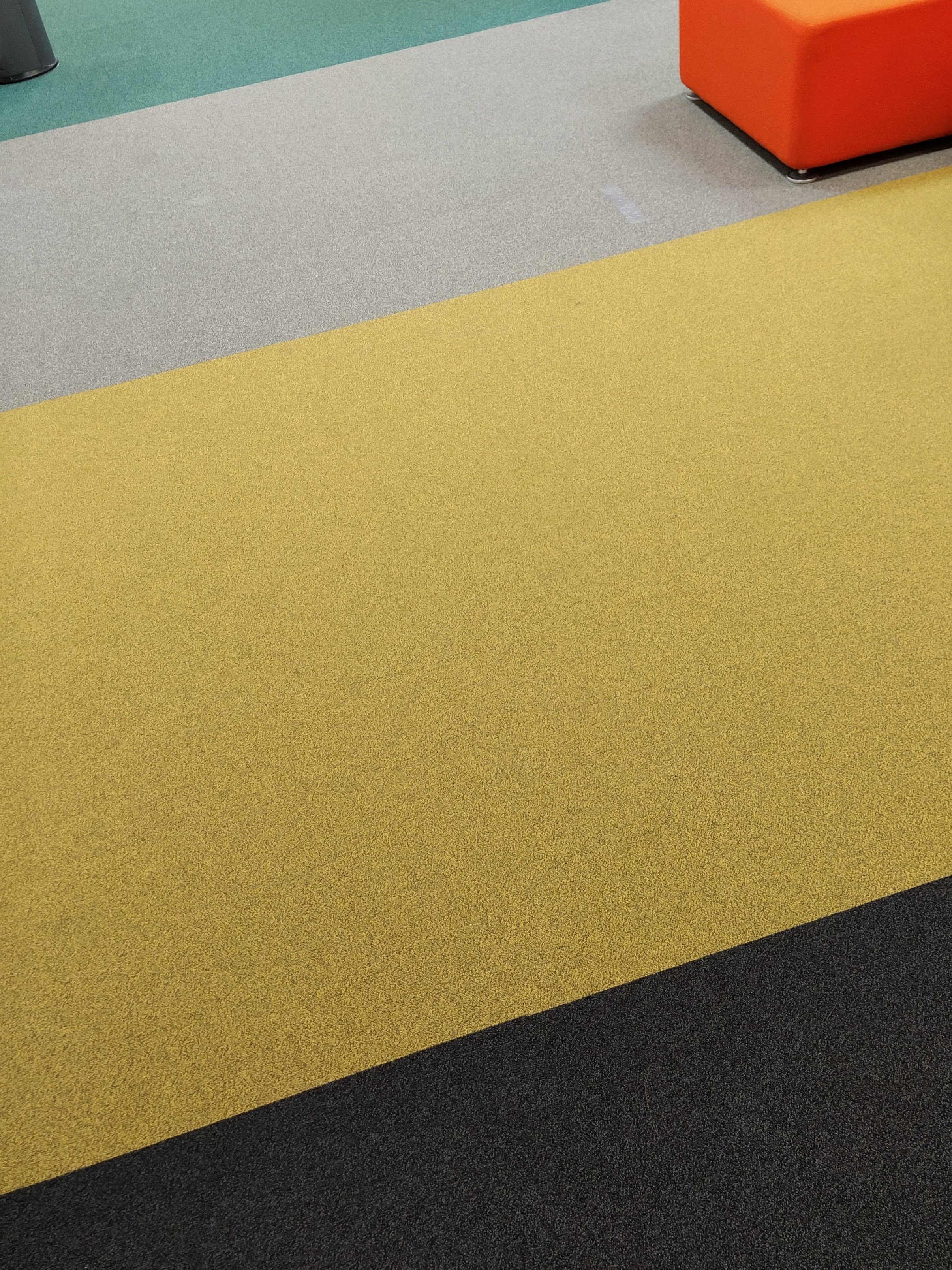
We selected flooring solutions that reduce noise in the space while adding a sense of luxury to the reception area and a vibrant atmosphere to the employee gathering space. By opting for bolder colors for the flooring, we further enriched the overall color palette throughout the interior space.
A significant aspect was finding a solution for the terrace, which was not functional due to wear and tear. We completely renovated the terrace area adjacent to the office spaces, including changing the flooring and selecting furniture that provides protection from rain and sun. By using wood for the flooring, metal for the structure, natural materials for outdoor furniture, and incorporating more plants, we introduced an element of nature into the predominantly screen-based work environment.
We fulfilled the request to design a new relaxation zone separate from the workspace by removing sections of existing glass partitions and constructing new walls to create a larger area for dining, socializing, and brief internal meetings. By installing new flooring and harmonizing existing furniture with newly chosen elements, we established a spacious relaxation area that is acoustically isolated from the rest of the open space work area.
To achieve better internal operations, we implemented a new color scheme for the entire space, aligning it with the graphic standards book and highlighting each meeting room.
Soundproofing for rooms used for phone conversations or online meetings was achieved by selecting sound-absorbing wall panels, insulating the ceiling, and installing new glass doors with enhanced sound isolation.
Partial adaptations were made to the restroom facilities to improve their functionality, including the introduction of new elements such as sinks. By selecting faucets in different colors, we further emphasized the playful element that was one of the client's requirements.
The result is a space that meets all the client's requested criteria, providing a work environment that is fresh and contemporary, enriched with zones for relaxation.


